Monday, February 24, 2014

Cuckoo for Lilla Rogers MATS Bootcamp!

I'm taking a break from Spoonflower this week to focus on an online course I am currently enrolled in from the Lilla Rogers Studio, 'MATS Bootcamp'. I have taken Lilla's 'Make Art That Sells' (MATS A + B) e-courses and loved what it did to help me update my portfolio and better understand what art buyers are looking for when they are buying art to go on products. MATS Bootcamp will help me to further develop my portfolio as well.
Lilla Rogers' MATS Bootcamp!
The first month's assignment was to design a cell phone case using elements in a cuckoo clock. I approached this assignment by drawing cuckoo clocks of all kinds. Then the winter olympics started in Russia and I thought the architectural elements in their buildings were beautiful and would be fun to incorporate into my design.  I started by drawing lots and lots of building, clock and bird parts and then assembled and colored them in Photoshop. I then drew lots of elements to make patterns within my shapes using my iPad (adobe Ideas app). I finished the phone case idea and then added pattern coordinates using some of the elements from my cuckoo clock design.
Lilla's suggested colors were a big change for me because I lean more toward using cool colors than some of the warm tones in her palette. I think I'll be using these colors more often!
This is where my design ended up...
'Cuckoo' ©2014 Patty Rybolt Designs
Lilla's suggested color palette!

Tuesday, February 11, 2014

History of Jazz

This week's Spoonflower Design Challenge is 'celebrating the rich history of jazz music'.

I got started by researching on Pinterest. I have a 'vintage graphics + ads' board that has a ton of old Jazz record covers from all of the greats like Miles Davis, Dizzy Gillespie and Duke Ellington.
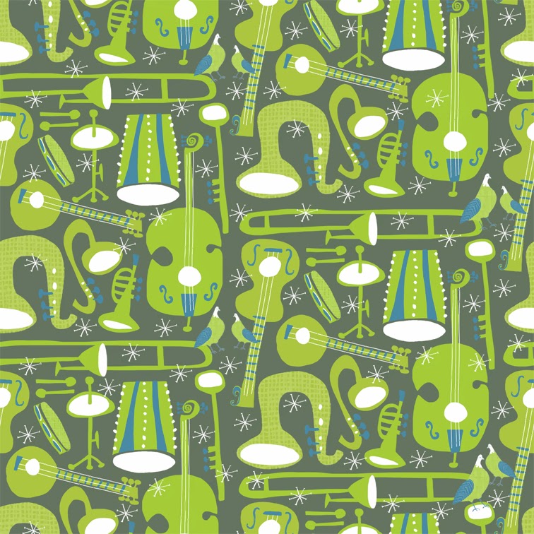
'Jazz Groove' ©2014 Patty Rybolt Designs
fabric, wallpaper, wall decals and gift wrap available soon at Spoonflower.com
I am such a fan of the design from this era. Most of the album covers and posters were done with a limited color palette to keep printing costs down, so I restricted my pattern to 2-colors and white. The green and blue combined at 50% on top of each other make the background olive color.

The instruments were all drawn on my iPad with the Adobe Ideas App. All of the images were done in black and white, sent to 'the cloud' and then colored in Photoshop on my desktop computer. The details like the pigeons, starbursts, dots, stripes and details on the instruments were done with india ink and a '0' round brush on copy paper. I like the painterly feel the marks give to the finished design. When the ink was dry I scanned the marks and colored them in photoshop as well.

Why the pigeons?
They just felt right!

Some of my favorite old album covers… (from Pinterest)!
Miles Davis,
Newport Jazz Festival, 1958
Miles Davis
Dizzy Gillespie…
Fab illustrations on this one!
"Cal Tjader Quintet" 1956 Fantasy Records 

Dizzy Gillespie
Roy Eldridge, Collates,
Cover by David Stone Martin

Abner Graboff design, 1955,
Pete Jolly Sextet.
From Mid-centuria blog.
Paul Bacon design Blue Note 10
'Mellow The Mood'
Hans Michel + Günther Kieser, 1957
Previews designed as a fat quarter fabric size (21" x 18"). Voting starts Thursday, February 13th, 2014 and continues until Thursday, February 20th, 2014. Please Vote!

Wednesday, February 5, 2014

The Anti-Valentine!

Spoonflower design of the week had a different theme… the Anti-Valentine! They posted… "Sometimes we wish Cupid would pack up his arrows and go home. Hearts, flowers, and chocolate make us a little queasy. If you're sick of romantic comedies and love letters, we have the challenge for you! Create a design styled after a traditional cross stitch that expresses some Anti-Valentine's Day sentiments."

'No Thanks Mr. Valentine!'
©2014 Patty Rybolt Designs
Research on the internet proved to be mostly skulls and dead roses and I thought this theme could be a bit too negative for me. I decided that I would take more of a comedic approach. Time was short for this assignment so I took to looking over my sketchbooks for inspiration. I zeroed inn on my snail, bunny and owl sketches and tried to come up with a way to twist them into the 'anti' theme.

My happy snail needed to stay happy, so I put her in control of her situation. Just added her purse and she was good to go. Owl's illustration was ready except she was happy in my sketch so I flipped her eyes to change her expression.
original owl drawing
©2014 Patty Rybolt Designs
Bunny was recovered from some 'spring' sketches and transformed into a voodoo doll with some simple pins and a broken heart! The 'love is for suckers' idea came first then I simply drew a 'sucker'! Next I drew embroidery hoops as a frame for my designs.

All of my illustrations were done in india ink marker, scanned and colored in photoshop. The textures used on the embroidery hoops are simply a burlap photo and pen marks that I made and adjusted in Photoshop then colored and layered. (In Photoshop go to --- 'filter' - 'adjustments' - 'threshold').

My design above is shown at 1/4 size of the preview (preview is a fat quarter 21" x 18"). Voting starts on Thursday, February 6th, 2014 and continues to Thursday, February 13th, 2014. Please Vote!!